<< Back to Warzone Classic Forum   Search

Posts 192 - 211 of 233   <<Prev   1  2  3  ...  6  ...  9  10  11  12  Next >>   
Logo Design Contest: 2/2/2015 04:48:01


Dutch Desire 
Level 60
Report
Very appropriate for this strategy game: a brain that look like a warlight/warzone map.
Made it myself in Inkscape. If you don't like the different shades of gray, or the text-style of the word WARZONE then i can adapt that easy to your desire.

Edit: Version in color


Edited 2/3/2015 04:14:18
Logo Design Contest: 2/2/2015 05:51:34


Polat Alemdar 
Level 58
Report


if there is not a problem when you are using warzone name there should not be a problem to use these logos too.
Logo Design Contest: 2/2/2015 13:11:25


[WM] Gnuffone 
Level 60
Report
3 months from now, people will have forgotten that there ever was a name change. "Has it not always been Warzone? And what is 'Warlite' anyway? Some sort of diet soda?"


exactly. i really can't understand why so many people cares about the name.
Logo Design Contest: 2/2/2015 21:21:54


Incaman
Level 58
Report
Right Ottoman

Fizzer already stole the name from another game, so he may as well steal the logo.....when going down the rabbit hole......well you know. Apparently he has no problem stealing other people ideas as it suits him.

( forgot the full stop at the end :D )

Edited 2/2/2015 21:23:56
Logo Design Contest: 2/2/2015 21:33:19


TBest 
Level 60
Report
The Logo posted by Orange (on this page)is so far clearly the best one.
Logo Design Contest: 2/2/2015 21:40:53


CouchCoach
Level 48
Report
Personally a name change will be fine as long as all warlight links I.E. warlight.net/multiplayer, /singleplayer, /dashboard, will still link to there proper areas. A new Logo couldn't hurt, but the page color would still be nice as it makes things easier to read on mobile devices (at least for me). I also stand with everyone as the dashboard I find is kinda crap (not to the likes of Mecha-Hitler), but still non the less bad. My Games & Open Games work 10/10 -IGN approved. I highly doubt anyone hates clicking two different tabs or reading to see games/settings. I support a name change, but Warlighters should be get a name change for a nice gift or remembrance; and just as a personal opinion Fizzer you seem to be building bridges over peoples complaint and not directing them with proper counterpoints only that and I quote "Cheng kindi suxs (lik optik) gut ovr et" to be blunt. Enjoy the game highly and find it fun! -Bruce
Logo Design Contest: 2/3/2015 01:53:33


NinjaNic 
Level 59
Report

Something quick I whipped up. I liked the font.
Logo Design Contest: 2/3/2015 02:01:00


Thomas 633
Level 56
Report
looks like 1998 game. Make it modern, although the font is cool.
Logo Design Contest: 2/3/2015 02:30:12


Жұқтыру
Level 56
Report
Nah, I like the oldishness look of it.

Although I play games regularly that were made in 1995.

Edited 2/3/2015 02:30:56
Logo Design Contest: 2/3/2015 09:05:51

evilfairy
Level 53
Report
Repost :)
Logo Design Contest: 2/3/2015 22:12:32


Banana 
Level 61
Report
Logo Design Contest: 2/4/2015 18:32:56


Riveath
Level 59
Report
YES! YES!!!! Banana's logo is even better than sh4ad0w's (sorry).
Let me post it BIG here.


What an artist. If this will be our new logo, I'm totally for the name change!
If you haven't seen the Potato Duel map you'll probably not understand this logo.
(PS : Just remove the bonus brackets)

Edited 2/4/2015 21:33:55
Logo Design Contest: 2/4/2015 20:43:48


(deleted)
Level 59
Report
<3 Banana
Logo Design Contest: 2/4/2015 21:14:41


[NL] Emillio
Level 55
Report
What exactly is the thought behind your logo, Banana? I don't see what it represents.
Logo Design Contest: 2/4/2015 21:23:33


DanWL 
Level 63
Report
These following screen shots are at 19.4% zoom. The stroke colo(u)rs can be any colo(u)r. Stroke thickness is 10px for if the logo is 10 times too big. Also, if the logo is too big, everything else will have to be reduced in proportion to the size it needs to be.

My logo #5:


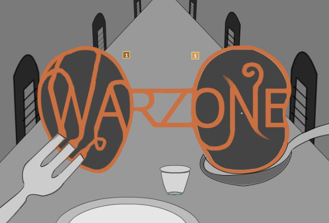
My logo #6 (includes bonuses!):


Edit 1: I, personally, think the above logo looks better without bonuses.

Edit 2:
My logo #7 (no connections):


Edit 3:
Logo #8 (no connections or territory effects):


Edited 2/5/2015 07:03:32
Logo Design Contest: 2/4/2015 23:46:04


Banana 
Level 61
Report
Thanks for the support guys! Muchos appreciated


Also i gave it another shot, though not as artistic as last one -> http://gyazo.com/e04e9ea7fb98a6f6b2019279e1d0351f
Logo Design Contest: 2/5/2015 00:12:17


TBest 
Level 60
Report
Banashake's image
(P.S use (without the X) [imgX]URL HERE[/img] to display the image yourself)


Edited 2/5/2015 00:15:54
Logo Design Contest: 2/5/2015 00:49:37


Jefferspin 
Level 62
Report
Banana, Fizzer may never make this an official map but I definitely think he will make it the new logo.
Logo Design Contest: 2/5/2015 02:34:19


Dutch Desire 
Level 60
Report
Nice too see that other players took my brain as profile picture. :)
Here it is in big:

I didn't spend much time on it, so that's why it has some flaws.
Logo Design Contest: 2/5/2015 02:37:42


Odin 
Level 60
Report
^this
Posts 192 - 211 of 233   <<Prev   1  2  3  ...  6  ...  9  10  11  12  Next >>