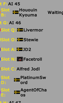
I'd suggest most likely widening the column size for the screen that you get before a game starts. As of now, it cuts off names in an awkward fashion.
Here is what it looks like:

Also for more visual appeal, it would be nice if the names and slots and other things were arranged gridlike, so they aren't all offset from each other like they are now.
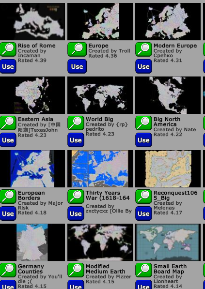
Adding on, I noticed that when looking through maps to create a game on, a lot of the map thumbnails look blurry, as such:

When viewing the info boxes for mods, if you click to view the info for another mod while you already have a mod info dialog up, the first one persists under the new one, and you'll have to close both. It would be nice if when opening a new dialog, the first one closed instead of persisting.
Edited 2017-05-09 00:49:35