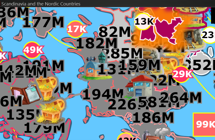
An option for small fonts would be useful ... ideally a checkbox somewhere quickly accessible and quickly toggleable. The big fonts are nice when looking at the large map zoomed out, but when zoomed in on large, dense maps like Scandinavia, it's super difficult to identify the borders between territories, the # of armies on a given territory, and even click on a given territory b/c the border lines are obscured by the #'s.
Sample:
(this was taken at maximum zoom)

You can see here in the middle that there's an army camp near the middle of the pic, a merc camp to the southeast of that, a cache to the east , and a mine (behind the '159M') between the army camp and cache. The numbers in this area all overlap, and there's actually ~15 territories just in this small area of these 4 locations I've highlighted, and trying to click on one without capturing it to click on Connections List or Connection Arrows is difficult without accidentally clicking on a territory, resulting in accidental captures, not maximizing Joint Strike, inefficient capture strategies, etc.
Edited 2020-08-28 03:17:26