2 recommendations:
1) Remove intermediate 'View' page
Please adjust it so that the 'View' button from the main notifications list opens up the actual relevant content (forum thread, blog, etc) in a new tab/window (browswer) or normally (mobile app).
So go straight from clicking View from this page:

to just opening this (actual forum post):
https://www.warzone.com/Forum/568111-update-514?Offset=60And remove this screen - it's not necessary:

This intermediate View page isn't necessary. First, all the useful information is present on the previous screen (View/Delete buttons, notification title), or could be (timestamp of notification - just use the timestamp of the most recent notification/post, the 'Change Notification Settings' button, etc).
Second, the only thing we _ever_ do from this page is click View, Delete, or Back. View/Delete are available from the main list. Back takes you back to the main list. So it's superfluous.
Removing this intermediate page would reduce browser tab sprawl and also having to click 'Back' from it to get back to the main list, which just an unnecessary extra hassle when trying to keep updated on forum threads.
2)
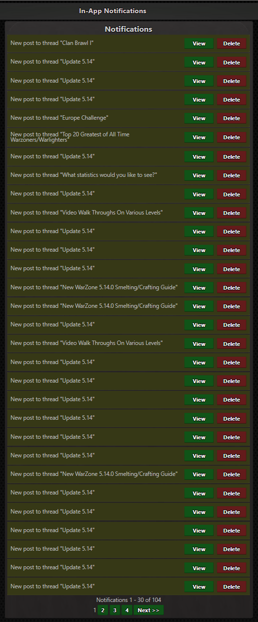
Please fix the Notifications list. It's too cluttered by threads with lots of updates. Can we pls switch from having 1 new notification per post to 1 notification per thread and just add # of updates in brackets for it?
Look at this:

And take careful note of this - 4 pages of notifications:

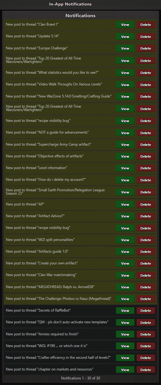
Now look at this after I deleted all the dupes:

And again, note this. Down to fitting on 1 page. So there were 3 entire pages of dupes:

The issue is not just that it's tedious to delete all the notifications, but that you inevitably end up reopening threads that you already read through b/c you didn't recognize it as a dupe.
Notifications as they stand now are tedious once multiple people start replying to a thread. These 2 recommendations would vastly improve this feature.