Please adjust the layout for Groups. It's not user friendly right now. They display in tabs at top of screen when viewing 'Chat', and are confined to 1 line, so as you add more Groups, the width of the name shrinks until it's no longer recognizable what group it is, and the space to click the group becomes so small, it's hard to accurately switch between tabs.
As a result, many have had to limit their use of Groups b/c it's not feasible at high quantities. Even on the web client, it's awkward, but on mobile it is even worse.
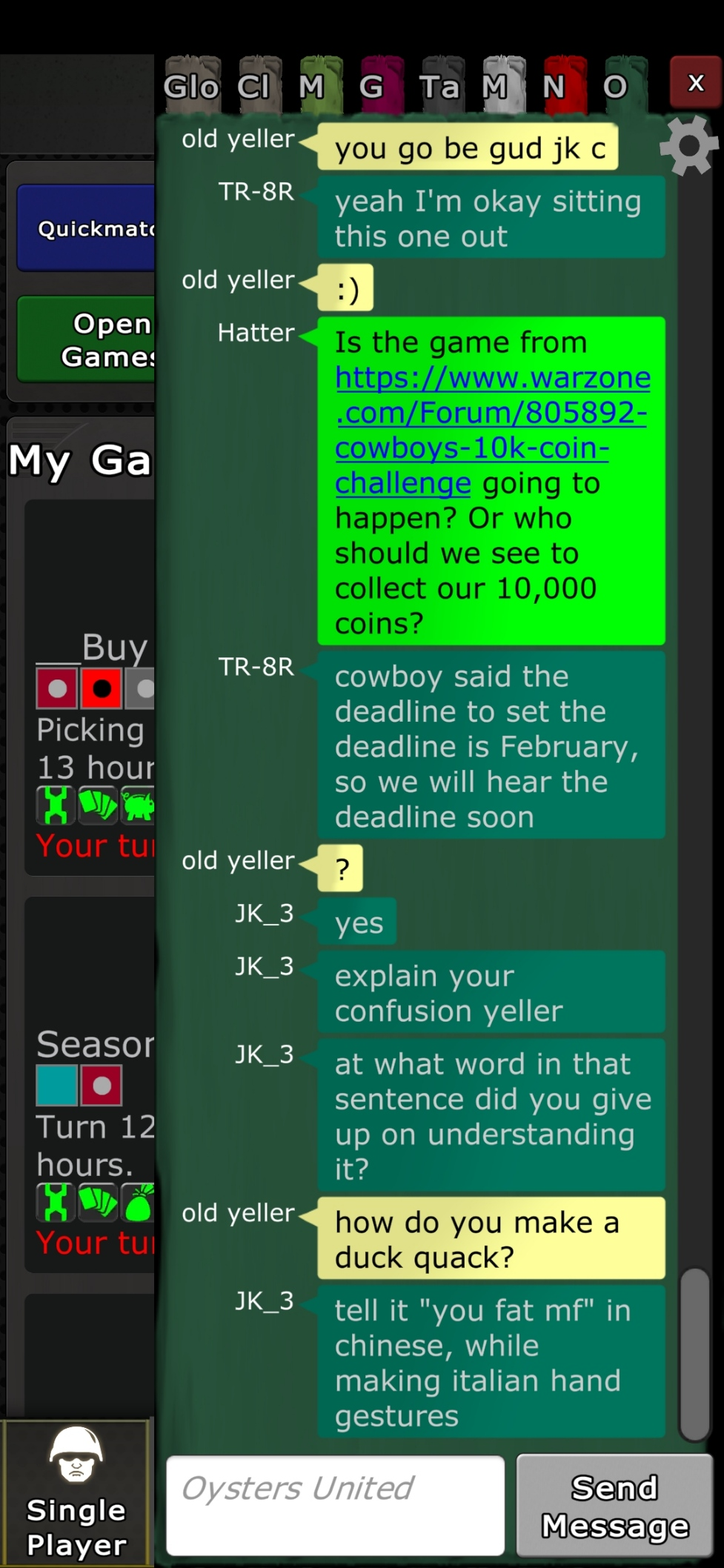
See screenshot. It shows 6 groups on mobile + Global Chat & Clan Chat. I've limited myself to 6 groups b/c any more than this, it becomes unmanageable.
Here's another example of how poor it looks with higher # of Groups - the tabs are so small that it's just simply not usable, it's not possible to tell which group is which, nor tap between them:

Making the list vertical with a scroll bar would increase the ability see and use them. Having a drop down selector box to indicate which group content to show or a page selector of some kind to go become pages of groups while keeping each individual tab wide enough to see the name & be able to click/tap it would make it usable.
