WarLight has just been updated to version 3.12.4! This update brings new images for cards, as well as a few minor improvements and bug fixes. This blog post describes what’s changed.
New Card Images
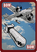
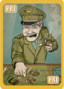
WarLight has new graphics for all 13 cards! This is just a graphic change — the functionality of all the cards remains the same.


The images were drawn by Sam Trout
Other Changes
– When a game ends due to elimination, orders now stop executing immediately instead of playing out the rest of the final turn.
– Added an icon for games that use commanders on the multi-player dashboard.
– On the map page, removed the links to create a game if you aren’t a high enough level to use the map.
– Multiple commanders can no longer die in a single attack/transfer order. This was only possible when offensive and defensive kill rates were set to 100%. The defender’s commander will simply not die.
– When loading templates, players who aren’t on your invite list are preserved. This fixes a bug when creating games that caused players that were added by searching to disappear when clicking Change Players.
– Fixed a bug in the My Games section that caused the team icon to not appear on games in the lobby when random teams were enabled.
– Fixed a bug that made single-player templates created via the “start with this map” link be considered built-in templates.
– Fixed a bug that made the AI sometimes attempt to send its commander to multiple territories.
– Fixed a bug that caused tournaments not use the description that was entered when it was created.
– Fixed a bug with the sockets feature that caused it to not receive updates if multiple clients were connected from the same IP.
– Tournaments exported to challonge now set the “quick advance” flag.
Awesome new card images!
However I can’t help but notice that the number in the reinforcement cards is out of place, is this because of the update?
Sorry my bad, the reinforcement card wasn’t changed at the time. It have changed now and looks pretty cool.
Tournaments exported to “challonge” now set the “quick advance†flag.
Challonge?
The WGL livestreamed tournaments use exports to challonge to show what the brackets in the tournament but ps was always complaining that they were not using the quick advance option which was off by default.
I find the new cards’ art very kitsch, but I hope I’ll get used to them soon enough
Nice, the images look cool
I can not create games on phone :/
I can’t either, but from Firefox/Chrome (tried both)
I hope there will be a UI option to disable card images. Very annoying and distracting 🙁
I agree! Quite distracting!! Actually hate the new cards. I hope there’s a setting to go back to the original, simple no-frills cards.
Card images look great – can the borders be different colours so it’s easy to tell at a glance?
I’m not a big fan of the new card images. Warlight was very appealing to me because of the abstract aesthetic, allowing players to play with this idea of pure strategy across many different themes. With these pictures you’re forcing the WWII era theme upon the game. Maybe more WWII era UI and graphics are coming out in the future but right now the card images seem a bit out of place/context.
Card images are ugly. No offense but this Sam Trout you paid as a freelancer is an amateur. He wasn’t worth your money and if the cards were to get changed why couldn’t you simply make a poll? They look stupid and gaudy and while I know some other disagree with me I know there are some who agree. FIZZER WHEN WILL YOU MAKE OUR POLLS?!?! Mainly the ladder polls but like why cant you make polls on suggestions? Uservoice doesn’t mention card image changes so why put it on the roadmap when there are other items in high demand?
tottaly agree with you. And I can help you answer your question – this is just anothehr step towards warzone. As Fizzer himslef mentioned – he is planning to make WL playable (“simple”) for retards. And stupid people love chilidish names like warzone and they will certainly love this “funny” images…
Please please please change it back its not warlight AT ALL
Cool the icon for team in my games has been fixed. I reported it :-).
I can’t be bothered to use the report button but I’ll let you know here : in history turn 0 checking manual picks from teammates (to see what spots were taken for instance), if you click on 1 pick to see where the name appears on the map, then history is back to your own picks, when you didnt want to leave the page of the other your teammate… Very annoying. Long (realise that you re seeing your own picks and not your teammates’ any more, have to come back to his page, remember which next of his picks you want to check, …).
Ok ill report that in the bug report too :-).
Can u add pop up private msg from other players? It’s rly a big problem during a diplomacy when u play with 40 players.
can you put images of all the cards up
Wanna see all the images,can you add them on forum?
I suggest swappable sets of card images. Then, if someone does a set of Roman era cards, you could play with Roman images instead of WWII ones. I thought the idea of cards was to be abstract, not historically specific. You could also just have the old cards as one alternative set of cards.
Also, with this idea, you could make something valuable for membership: Members are allowed to provide their own custom card images (subject to terms of use; no porn obviously; maps are reviewed, so card sets could be also).
You could also make the ‘can choose from a limited selection of card sets per game’ be an unlockable feature by levels, but leave ‘can use own custom cards’ to be a members-only feature. This way, for those that don’t like the new cards, they can just level up and use the old cards once they unlock the option to switch.
You should uservoice that!
Great idea.
I agree with a lot of what’s been said here.
I’ve taken a look as Sam Trout’s work and I like it.
But that doesn’t mean this new version works.
Awful. I made a silly mistake because the cards look soo similar. Ok I should’ve read the name but sometimes you are just tired and just play and when I play from my phone its easier because cards haver not been updated. Never thought I would be so happy to have a out of date version of an app!
Why? Thats a strategic game, not a graphic Novelle.
BTW, description of abandon is still abandon and not early blocade
Ugh. Some of them are ok, but definitely not as intuitive as the colors. A glance told you what you needed to know. Not so with these bad boys. They all have similar colors/tones/palette whatever you want to call it, but it’s not easy. Why? If you really want to make it better add in more colors or a basic pattern to distinguish recon/surveillance/spy, etc.
Also, please bring back “abandon”.
Could you add an option that allows us to select the old style of cards?
Immediate or Instant Blockade would be better than Emergency Blockade if you do change that new card graphic
I’m certainly a minority here, but I always enjoyed just logging on for quick AI-only games, playing on the variety of available maps. This option is now closed. There is no way to play an AI-only game except on the “main 5” maps. The new changes effectively killed Warlight for me. Unfortunate. I used to play nearly every day. I guess thanks to everyone who made maps, since you gave me much enjoyment.
You just need to change the filter from “Featured Maps” to “All Maps” and you’ll find hundreds.
The cards are okay, I guess (in the sense that they aren’t that hard to ignore, and only merit an eye roll when I open the card menu). The old designs were MUCH better.
After some time to get used to them, I now like the new images.